Lyst: designing an onboarding that learns your taste from the first tap
Lyst
Designing an onboarding that captures a shopper's taste from the very first tap
UI, UX, Design Systems, AI Workflow
Designing an onboarding that captures a shopper's taste from the very first tap
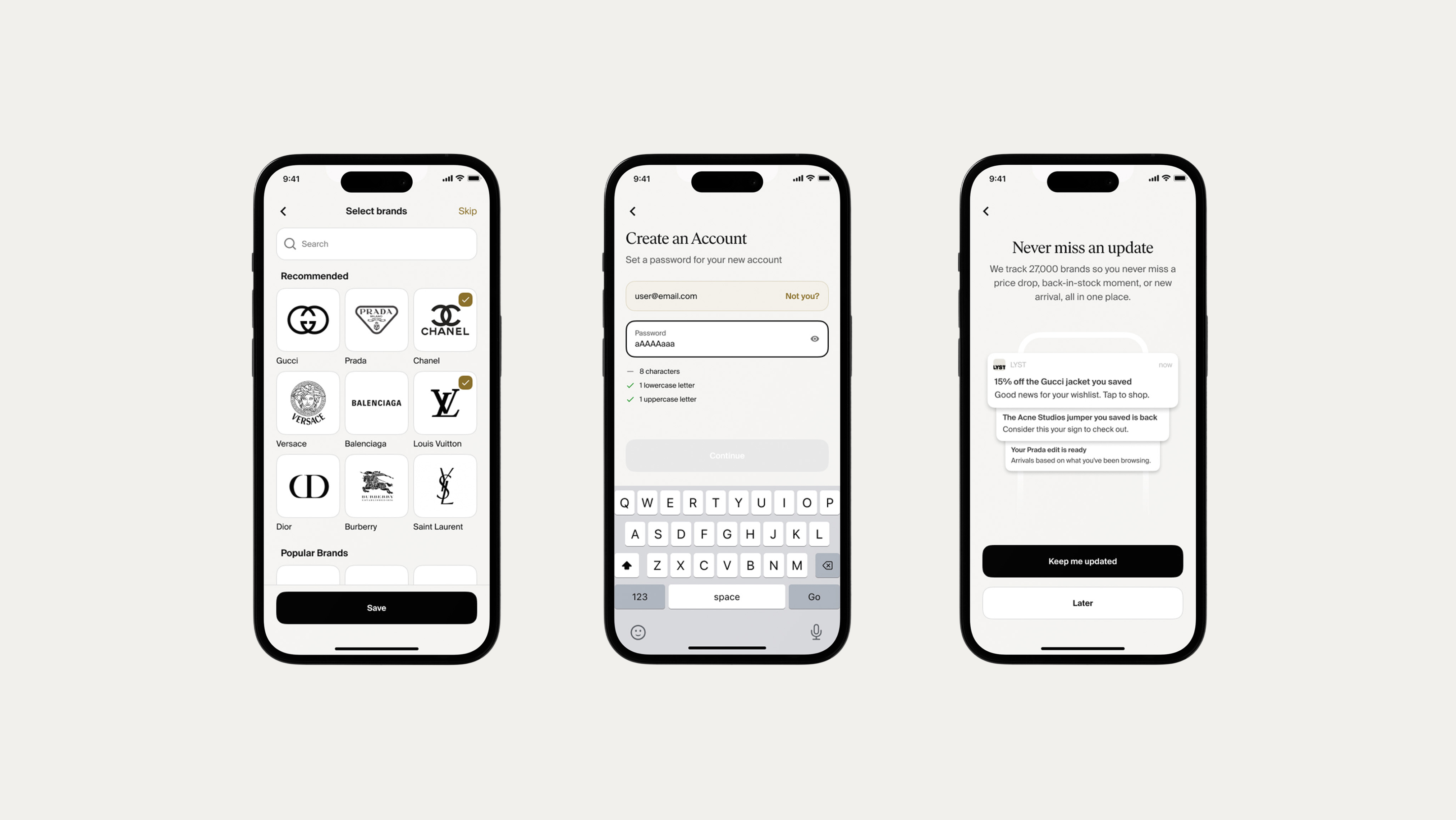
Lyst is a global fashion platform, and everything depends on understanding a shopper's taste. That understanding has to start in the first minute, before the feed has any history to learn from. I'm leading the redesign of new-user onboarding: taste capture, a style quiz, gender selection, and the contextual pop-ups that ask for the right thing at the right time, all built on a refreshed design system.
Where onboarding begins
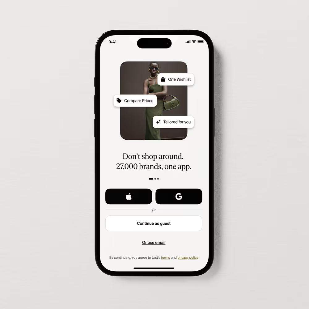
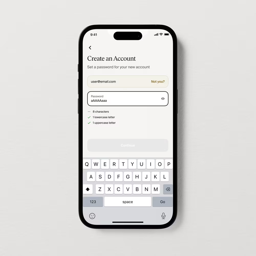
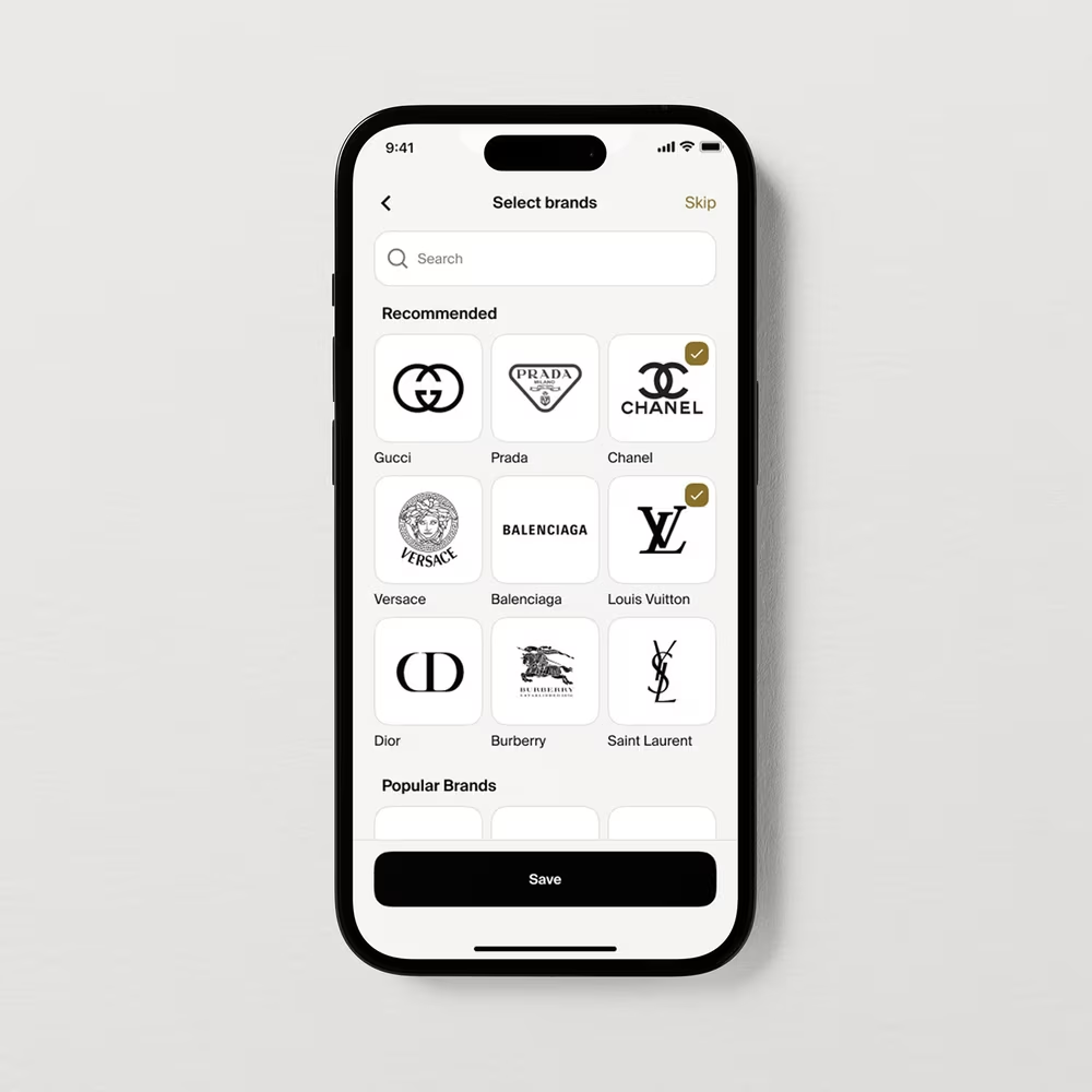
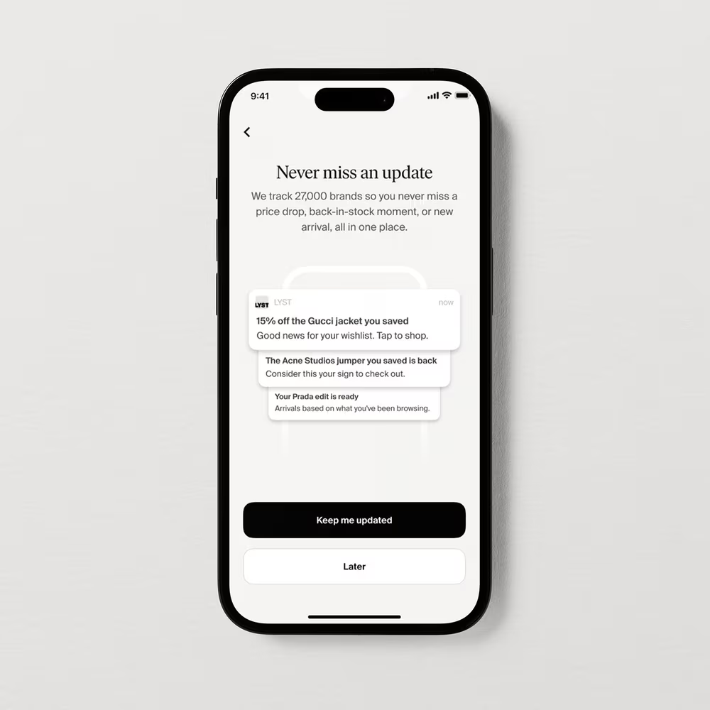
The first four screens a new shopper meets: sign-up, account creation, brand selection, and notifications. Each stays light on friction while quietly capturing enough taste to personalise the feed from the first session.
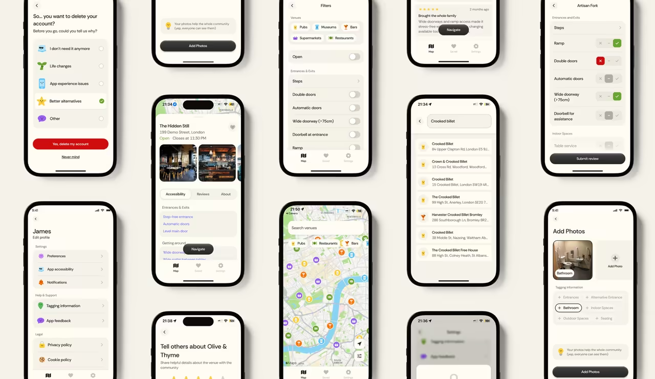
A personal project between my brother and me, for our disabled cousin, helping him find accessible venues and routes.
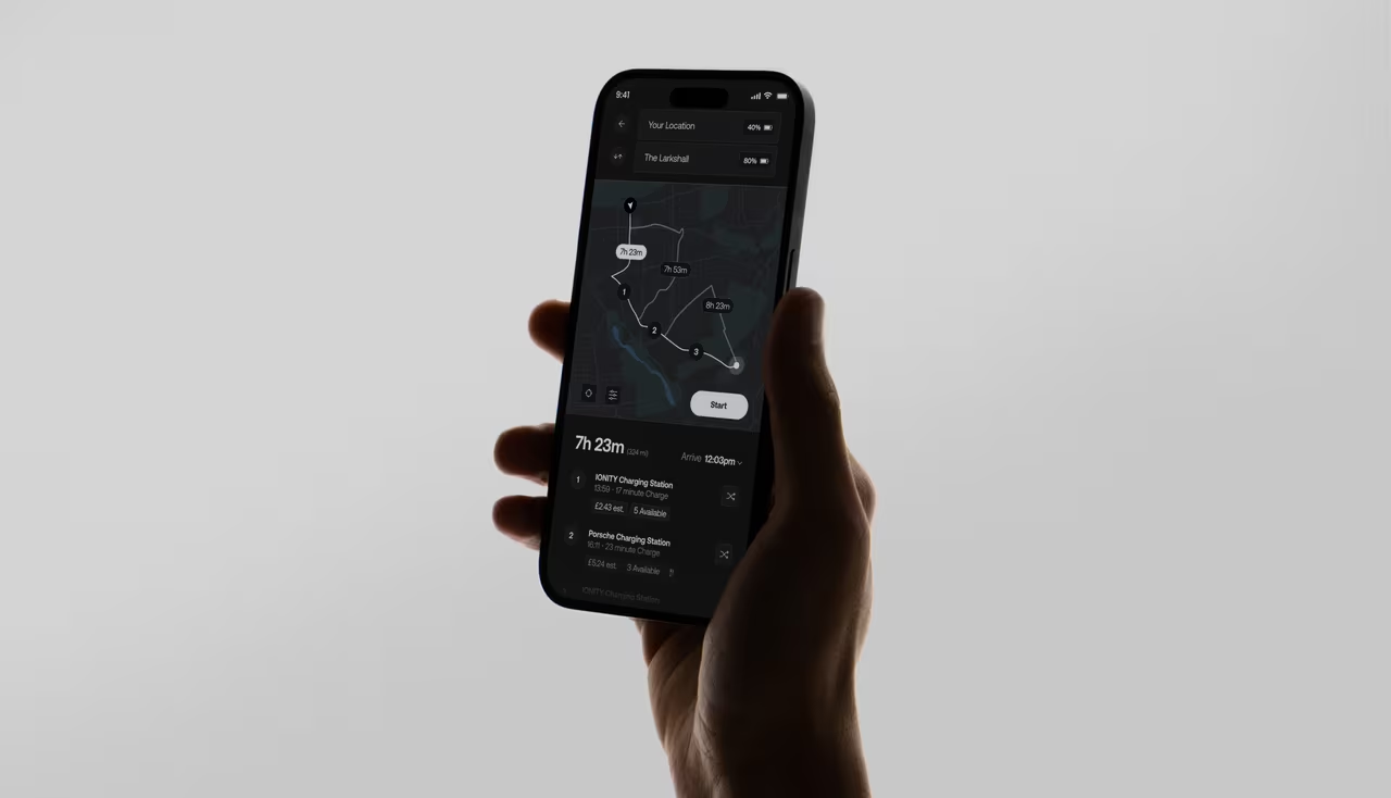
An intelligent EV charging app that eliminates range anxiety by automatically identifying optimal charging stations using real-time vehicle and battery data.
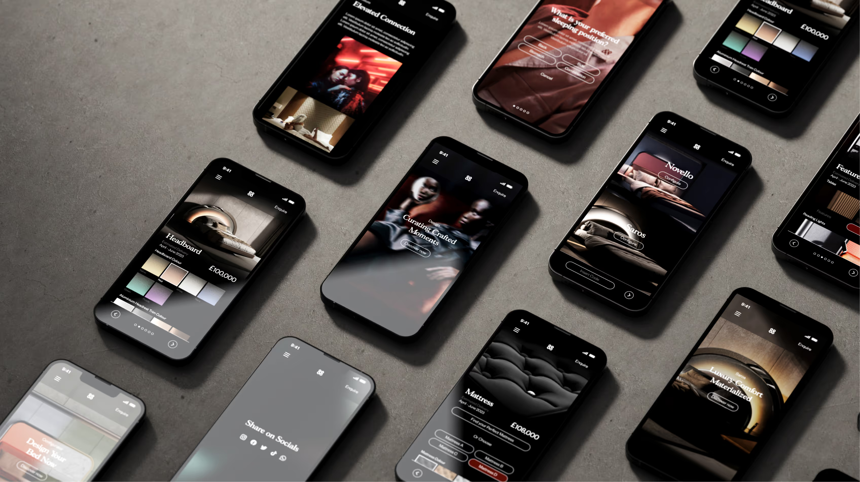
Understanding how £100,000+ beds are sold online through photorealistic 3D configuration and material visualisation.
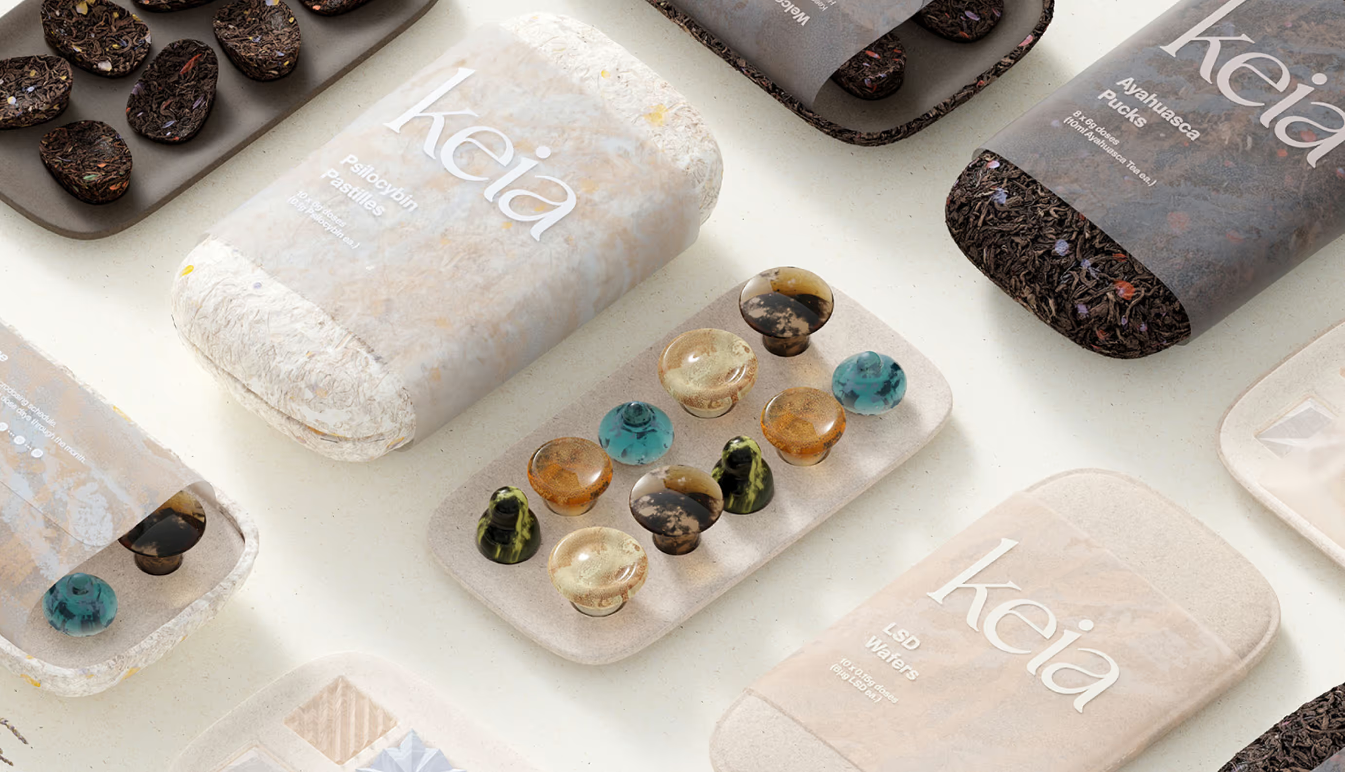
A collection of design work, some made it to launch, others were experiments exploring ideas across industrial design, branding, packaging, and UX.