Infinity: designing an intelligent electric vehicle platform
Infinity
Designing an intelligent electric vehicle platform from early concept to market launch
UI, UX, Strategy, Innovation
Designing an intelligent electric vehicle platform from early concept to market launch
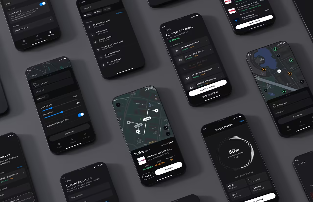
Infinity learns from how you actually drive and charge your electric vehicle (EV) to recommend the best charging spots for your specific needs. No more guesswork. No more range anxiety.
After the MVP launch amassed 8,000 downloads with 500 active users, I am now improving the product based on user feedback and real-world data. I led the design process for both the initial MVP and this enhanced iteration, focusing on refined user experiences, advanced personalisation features, and optimised charging recommendations.
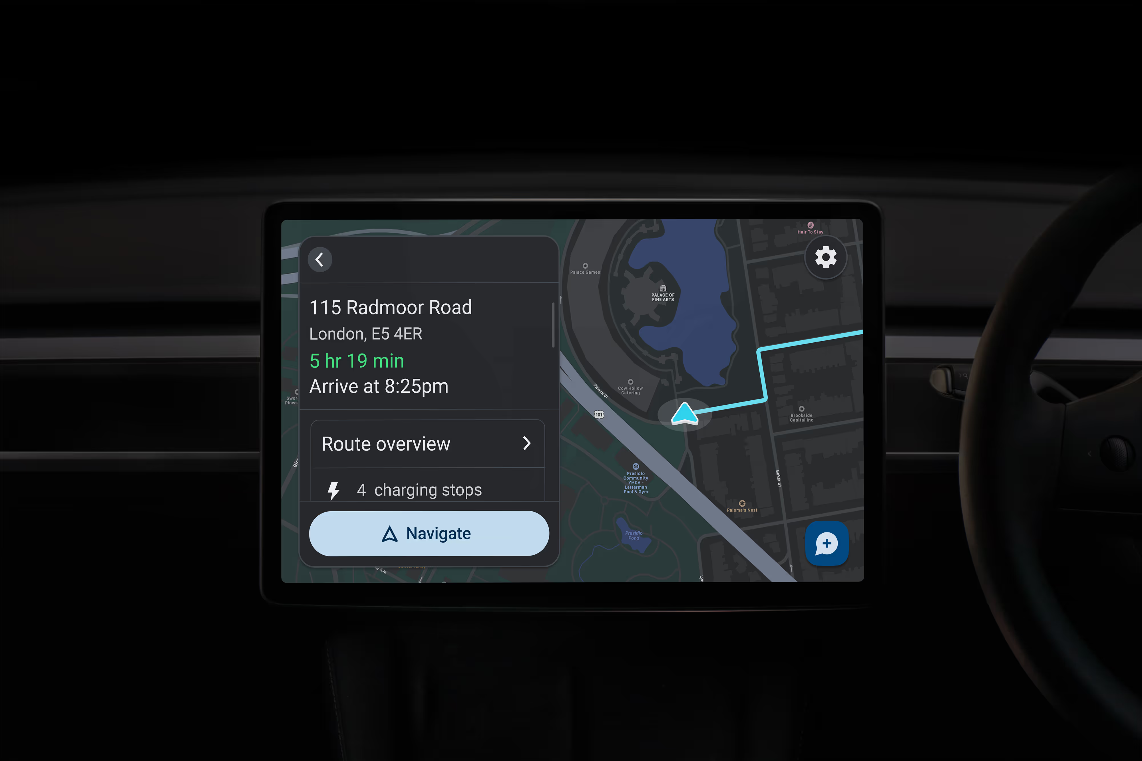
Building confidence in EV travel would be challenging
The UK now has over 63,000 public charge points across 25,000 locations, with major networks like Tesla Supercharger, Gridserve, and BP Pulse expanding rapidly. 99% of UK postcodes are within 25 miles of rapid charging. Yet despite this infrastructure boom, drivers still feel uncertain about charging decisions. The problem is not availability. It is knowing which charger suits their specific journey.
What we learned from sitting in car parks with anxious drivers.
I conducted 22 in-depth interviews over six weeks with EV drivers across the UK. Participants were recruited through EV owner groups, on-site station intercepts, and referrals to ensure a diverse mix of vehicles, locations, and experience levels. The sample included: 8 Tesla drivers, 6 BMW drivers and 8 others (Hyundai, Audi, Polestar, Mini). The ownership ranged from 3 months to over 4 years with a spread of urban, suburban, and rural drivers. The age ranged between 28-52, and a balanced gender mix.
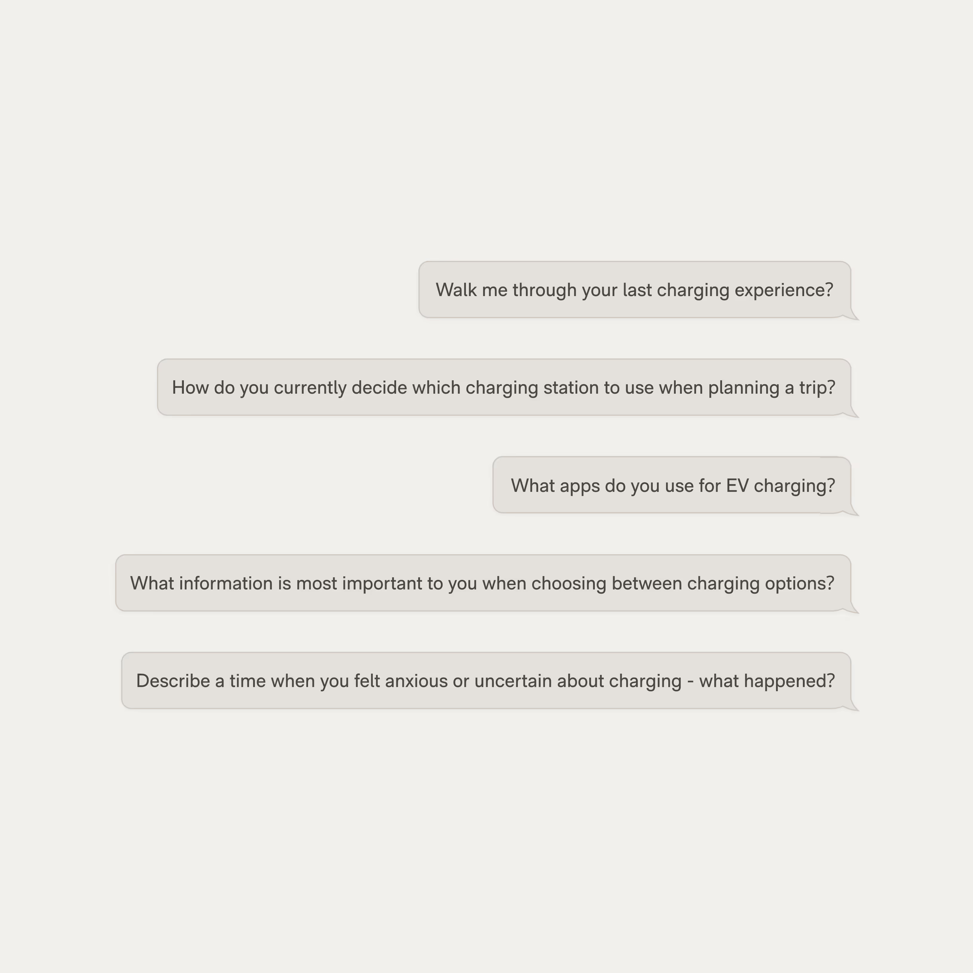
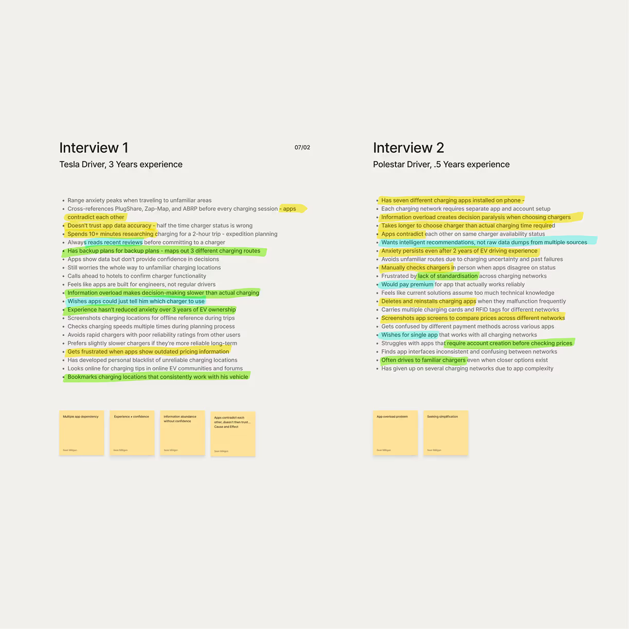
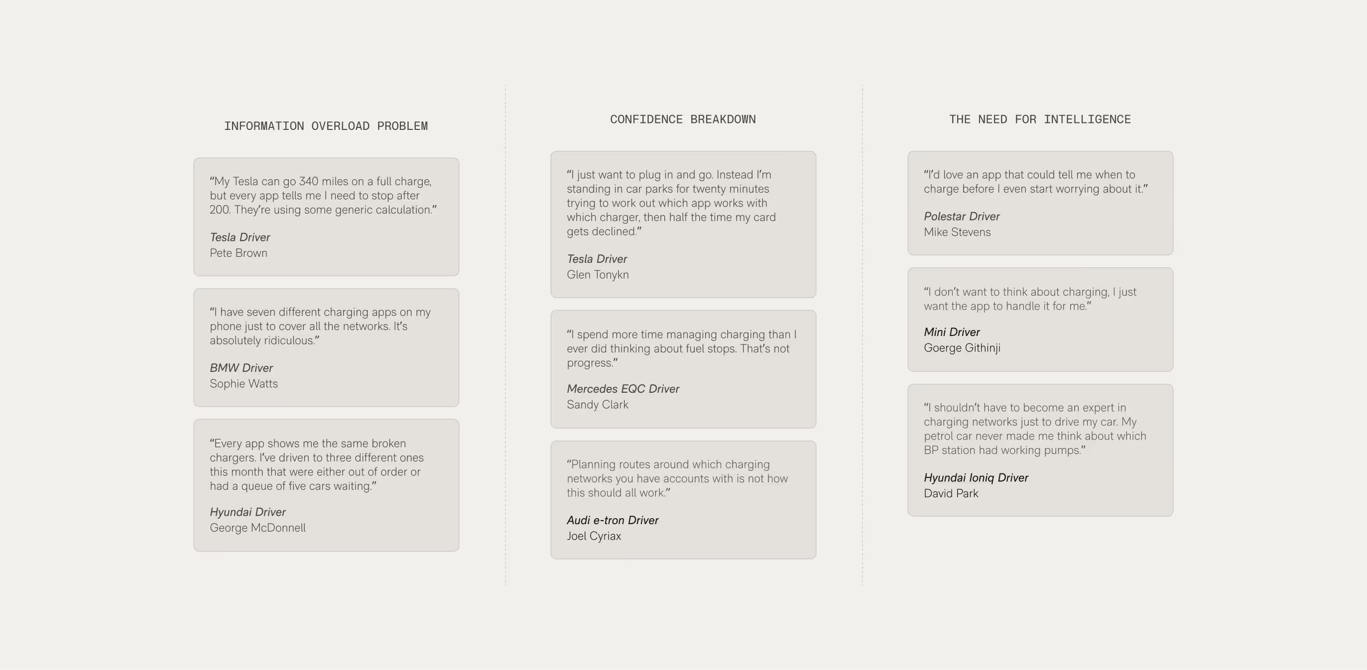
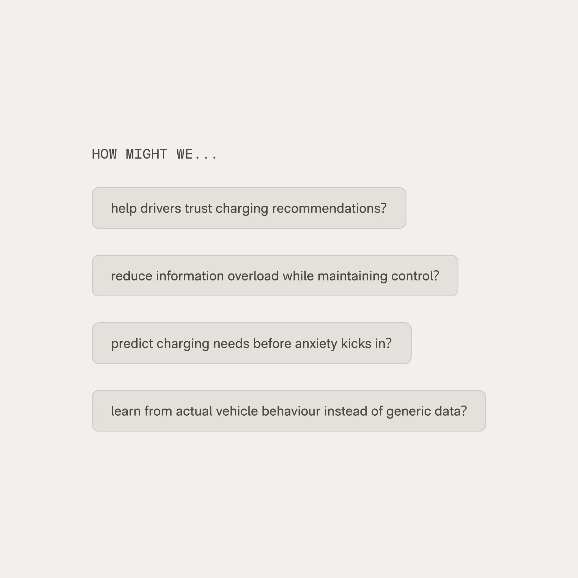
What did I learn?
Current solutions fall short of what drivers actually need. My research revealed a clear gap: while existing platforms display charging locations, they lack the intelligence to support real decision-making. Drivers get shown where chargers are but not which one is the right choice based on their vehicle, route, or context.
These were exactly the gaps existing apps weren't closing, so I went and looked at what everyone else was actually doing.
Where current solutions go wrong
Existing charging apps are excellent at showing locations but fail at intelligent decision-making. Current solutions either lack real-time status, suffer from poor usability, or create information overload.
Most apps miss the intelligence layer of EV charging.
After identifying consistent pain points, I defined three core principles.
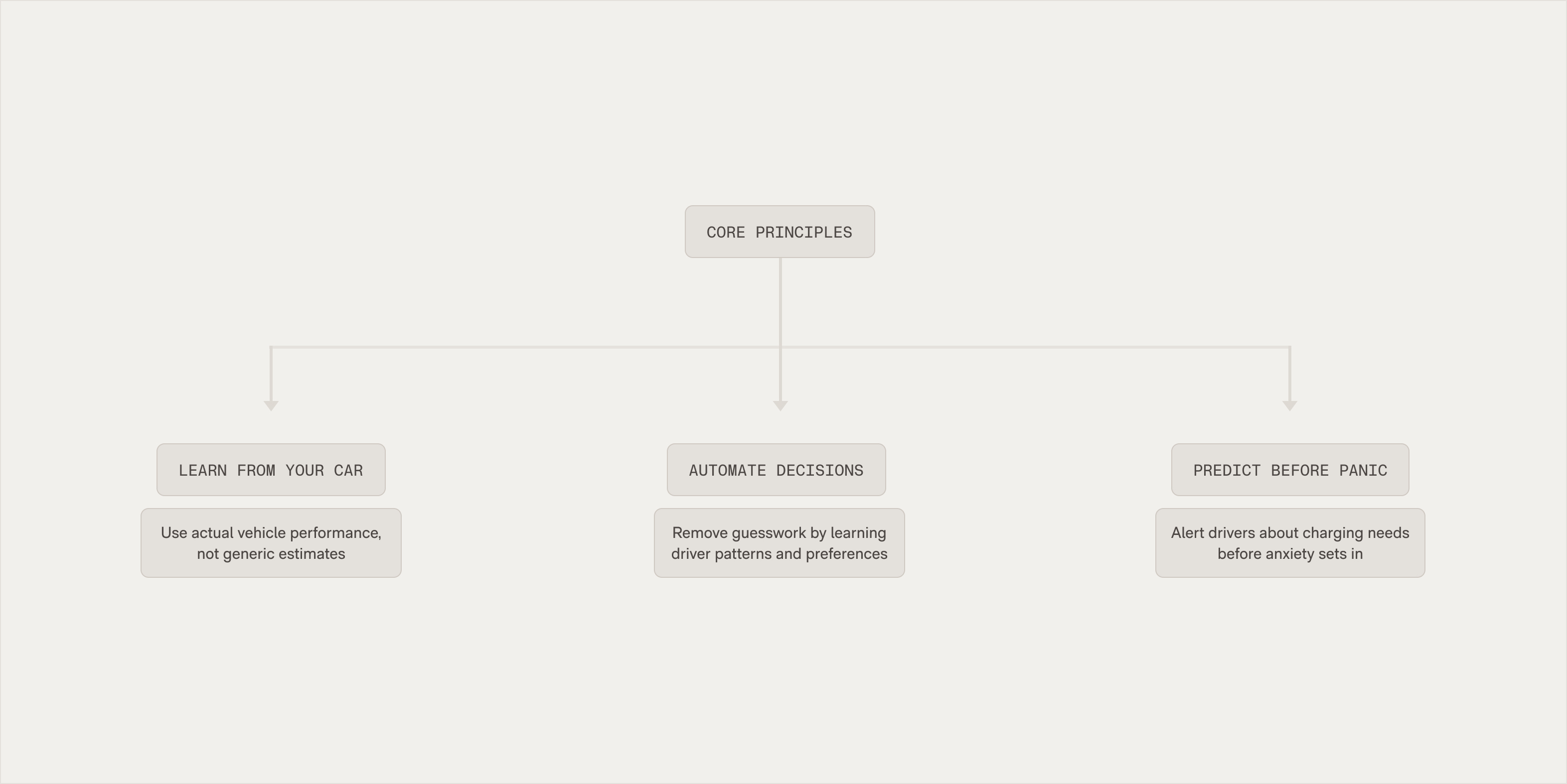
How we addressed key pain points
Three major friction points emerged that existing charging apps failed to address. Here's how I tackled each of them:
Wireframe
To validate interface decisions and test how the three concepts would translate into actual user interactions, I created wireframes for the core charging selection flow, the highest-stakes decision point where users experienced the most anxiety and decision paralysis.
Concept development and implementation
The wireframing process revealed that user needs aren't static: the same person might want automation during stressful motorway charging but prefer manual control when exploring options nearer home.
The wireframing process revealed that rather than choosing one concept, combining elements from all three created a more robust solution.
Information architecture
Based on user research revealing decision paralysis and multi-app frustration, I organised the app structure to prioritise immediate charging needs while keeping advanced features accessible without adding cognitive overhead.
The structure was validated through internal card sorting exercises, confirming that key features could be logically grouped and located within this hierarchy.
Atomic components
I designed and developed the complete atomic design system in Figma, building every component from basic atoms through complex molecules and organisms to create a fully cohesive brand system.
Final screens
The MVP is already live; onboarding and settings from the enhanced version have reached production through TestFlight, with the remaining features rolling out in stages.
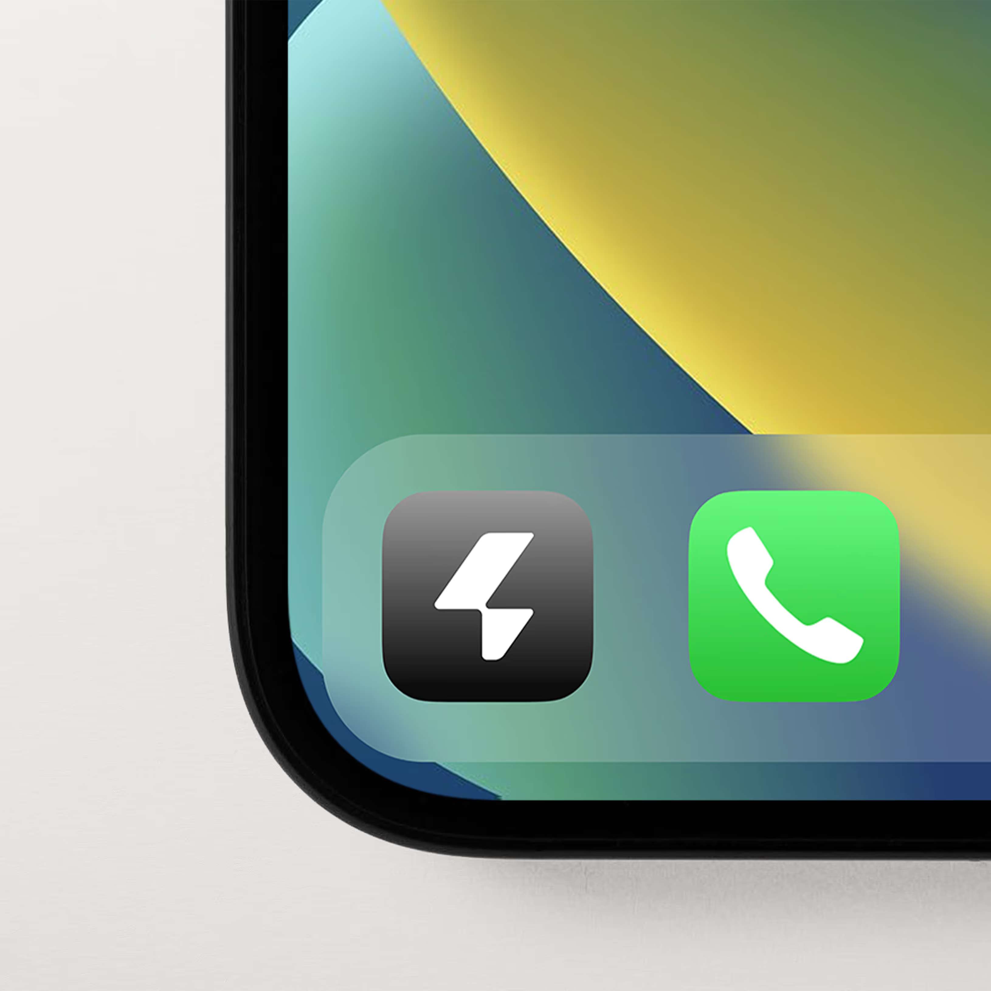
After 3 months in market with the MVP:
How has this project improved me as a designer?
Working on EV Infinity over two years reinforced the value of sustained user research and how behavioural insights develop through extended engagement with real user problems. The project demonstrated how complex challenges require patience and systematic iteration.
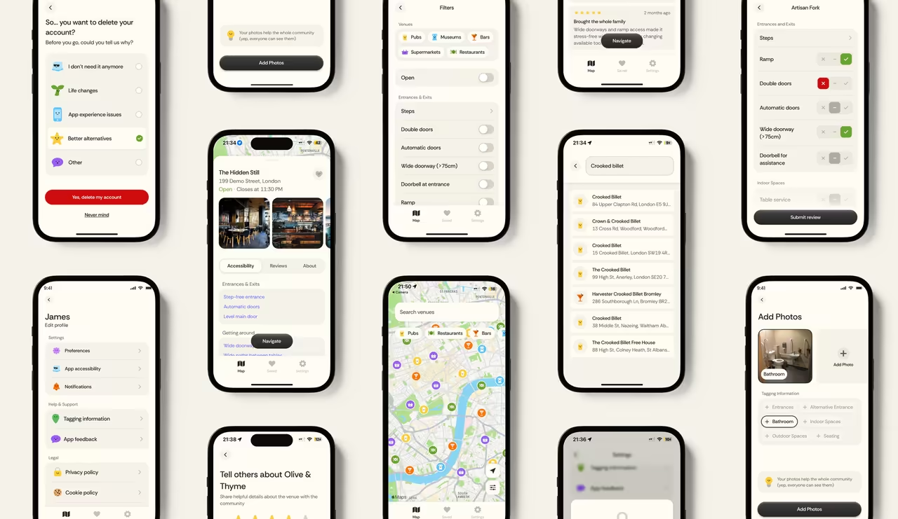
A personal project between my brother and me, for our disabled cousin, helping him find accessible venues and routes.
Building onboarding experiences and design system foundations while introducing AI-assisted processes across the design workflow.
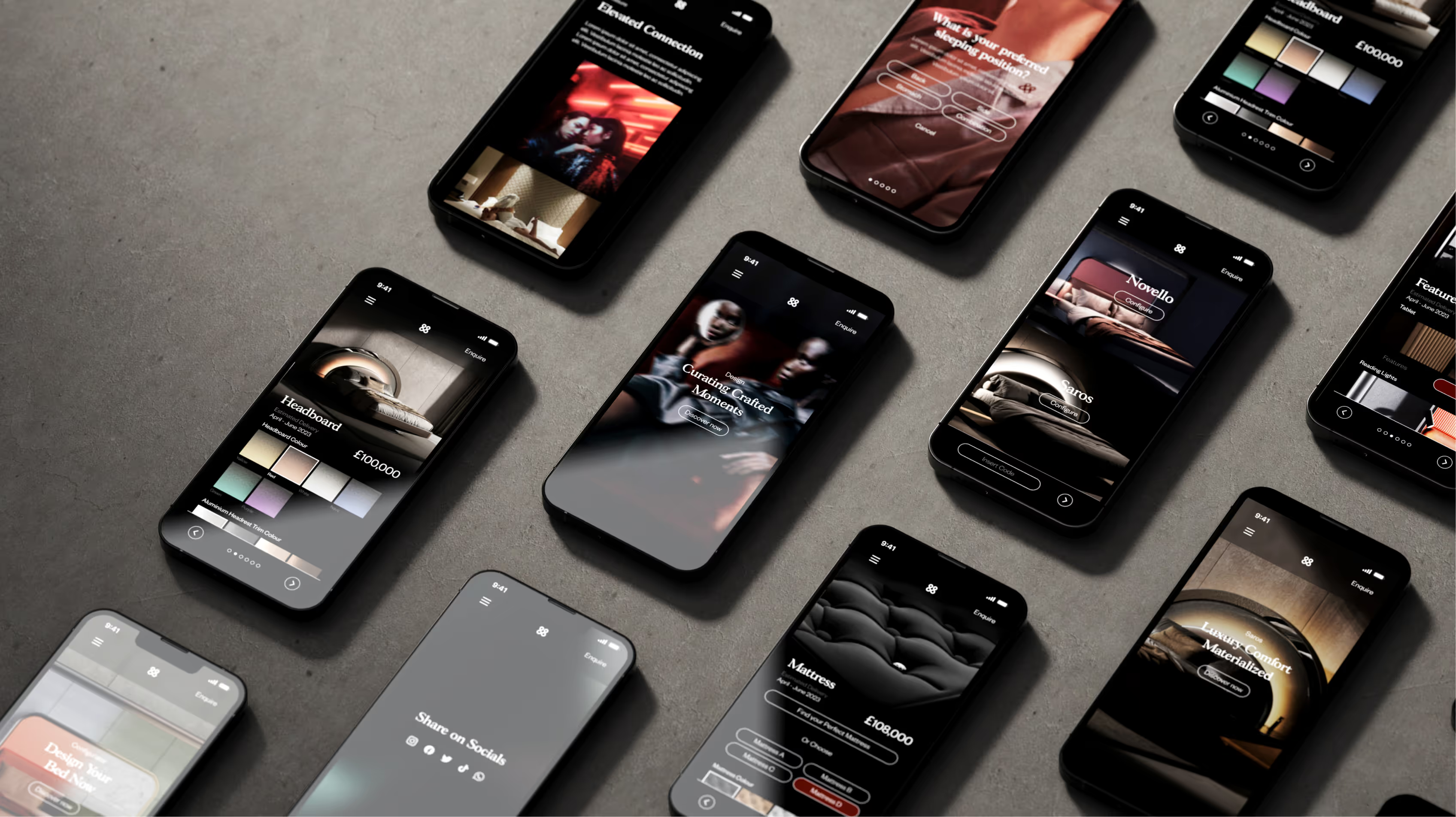
Understanding how £100,000+ beds are sold online through photorealistic 3D configuration and material visualisation.

A collection of design work, some made it to launch, others were experiments exploring ideas across industrial design, branding, packaging, and UX.